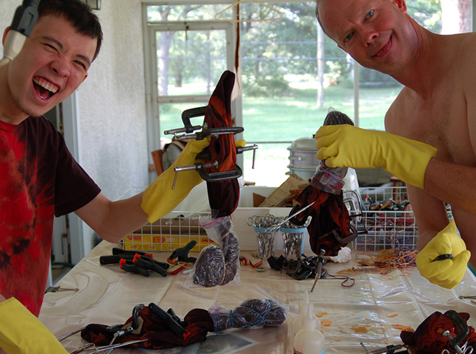
My son Craig and I having fun and making beauty in the dyeshop
Techniques 5 – Our Voices
Tie-Dye Secrets of the Masters of Fun and Beauty
We've put in a lot of hours in the dyeshop developing our techniques, and on this page we'd like to share some of our discoveries and design philosophies. We'll also be adding video content soon so you can see exactly how we work our techniques. We want to share our expertise so that you too can create beauty and have fun.
We've also discovered that our fabric work is good therapy. Many is the morning that we struggled through the first hour of the day, trying to generate enthusiasm and put aside the anxieties of running a business and the frictions that develop between people working together. However, whenever we flip on the music and face the work table, those anxieties and bad feelings melt away. Soon we're dancing, and I'm singing, and everyone else is (good naturedly) complaining about my singing. It's magic, and I hope you'll learn to feel some of it too.
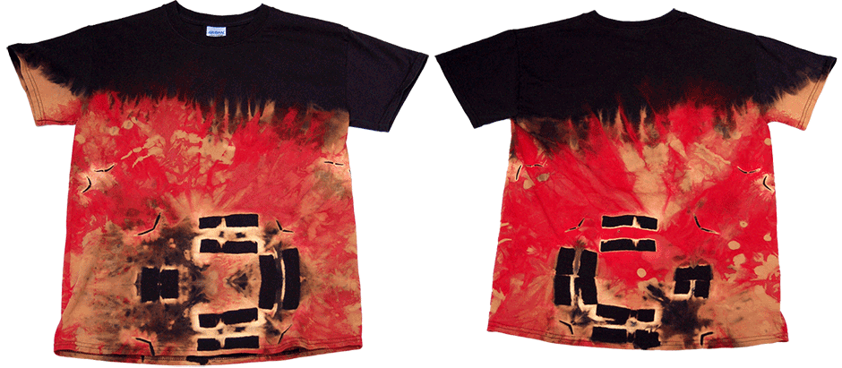
One of Craig's favorite pieces, titled Sculpture Burning
Craig's Voice
I really like designs that have strong contrast, a sense of flow and movement, and that reallly jump out at the eye.
I like letting the art flow and not overthinking when I do discharge resists. Instead of thinking about the design and then executing, I prefer to think while executing, or not think at all. The shirt constantly shifts and changes as resists are applied, and each one of these shifts resulting from previous resists can show a different, unique pattern when they're held intact with a resist (with string, a rubberband or a hemostat). Folding the shirt before applying a clamped resist creates patterns that will lead the eye and create flow while providing many opportunities to apply other resists that capture part of the shirt's own pattern.
When applying bleach, I often highlight major resists with concentrate, and use diluted bleach elsewhere to create contrast. To create a radiating pattern with more gradual fliow, I'll surround the concentrated area with areas that receive diluted bleach, and go with an even more dilute solution around that to add interesting depth.
When you fold shirts as much as I do, you'll often find that you have to clamp down the resist tighter then you would with an unfolded resist.
In cases of exceptional folding you will have to bleach both sides of a resist (though not neccessarily with the same strength of bleach) to get it to show all the way through. Don't be afraid to fold in an irregular pattern, moving across the shirt at different angles will create more varied patterns and shapes. Be sure to experiment with your work, even folds smaller then the resist you intend to use will create new and different patterns. Don't let fear stop you from trying anything that comes to mind – in fact, just let go of your mind and do it.

One of Richard's favorite pieces, titled The Seam
Richard's Voice
Taming Chaos with Precision
My work tends to reflect my personality, so my pieces are often meticulous, precise, and minimalistic. I love sparse and simple design, a philosophy that I think is particularly suited to the discharge resist process with its bold color contrasts. One of the big objections I have to most tie-dyes is their busy-ness and overly bold color schemes. I've seen some incredibly beautiful pieces in this "traditional" 1960's style, but unfortunately these designs have now largely been commoditized and turned into caricatures. Perhaps this is lucky for me, as I've seen almost nothing being done with tie-dye today that isn't trite, garish, or sloppily made, and so the field is wide open to innovation and high-quality work. I want to do that work. I am doing that work.
Color is the most important part of my design, and I'm fanatical about getting it right. Though I like strong contrasts, most commercially available pieces immediately turn me off with indiscriminate use of bold colors. Much of my own work is a failure in my eyes because the colors don't work for me. I'm also very particular about gradients, since this is the most valuable aspect of resist dyeing and discharge:
both techniques create beautiful, fractal gradients between colors. If the gradients don't work right, I feel the piece is a failure.
To help you avoid the pitfalls I've fallen into, here are some of my design guidelines and discoveries.
1. Think of the gradients instead of the colors.
Unless you're spraying colors onto a white garment in a single step and not allowing them to mix at all (similar to many commercial tie-dyes), the gradients of mixed color between your base dye colors are what is going to make the piece. If you follow my recommendations, your base colors (the colors of each dye you use) will only appear in a few areas as highlights, and the gradients will dominate the piece. Make sure you'll like the colors your base dyes and overdyes make when mixed.
2. Stick to one segment of the color wheel.
Not only are rainbow dyes trite, the color degree-of-difficulty increases a LOT with each additional color that you apply. Many is the piece I've unwrapped, oooo'ing and aaaaahhh'ing at the design, only to realize that it's ruined by one off color. Just one color that's too bright, too dark, too garish, or too pale compared to the others can ruin a design by becoming the main focus of attention rather than part of a harmonious ensemble. My preference is for colors that span at most one third of the wheel (yellow-green-blue, blue-purple-red, red-orange-yellow), or for carefully considered contrasting colors. Remember, that beautiful red, luminous blue, and glowing yellow add up to muddy browns, topPadding10px s, or even a (usually off-color) black when added all together.
3. Put down color before you apply a resist.
Nothing ruins a piece, for me at least, like applying resists to a white base and then slathering it with color. White is the highest contrast color in your arsenal, and if you fire a lot of it at once you'd better have a design that demands it, or at least that can live in relative peace with it. Far better to apply a color (generally a lighter color or shade), then a resist, and then apply another color to define the resist. Remember, if you apply a resist, you need to apply color (or discharge agent) to make that resist visible in the final product. I use resists on white, but sparingly. It tends to be the main focus of the finished dye.
4. When doing dyes (as opposed to resists), apply three layers of color.
Put down a lighter color or shade (yellow, red, turquoise), apply resists, then apply a second that works well with the first (red after yellow, blue after red). Apply a second set of resists, and dye the whole piece in a dark color or shade (dark blue, deep purple, black) by immersion dyeing. My favorites are yellow-red-black and white-turquoise-blue. This technique gives you multiple gradients between the three colors, and if you've chosen the base dyes wisely, your work will have a deep complexity that has a natural appeal.
5. Try a discharge step.
I used to do strictly dye resist (tie-dye), and while I liked the results it lacked complexity and sophistication that a discharge step can add. Now I almost always add at least one discharge step: I'll do the three stage dye described above, and then after rinsing off the excess dye from the final step, I'll apply another resist layer and discharge with household bleach. This adds a real sense of depth to the piece. Check out our Discharge Galleries to see some of the possibilities.
6. Add a vat dye step.
I love the ability of vat dyes to bleach the underlying fiber-reactive dye, which means you can take a commercially dyed black shirt and vat dye over it with yellow – and get yellow on black rather than muddy yellowish gray on black. You also tend to get a thin halo of bleached fabric surrounding the vat-dyed areas, since the vat dye solution contains a discharge agent (thiourea dioxide) that penetrates the fabric a little better than the vat dye. This adds a lovely fine detail to the work. My current resist dye procedure is to do a three step dye (as in 4.), a household bleach discharge (as in 5.), and then finish with a final resist and vat dye. It's time-consuming, but worth the extra effort.
7. Keep your resists TIGHT.
Another thing that bothers me about sloppy tie-dye is the blurry look of a loose resist. That is one of the reasons I've moved more towards clamps and away from ties, since I can get very precise resists that add fine detail to a piece. This is also the advantage of using sheer, fine fabrics rather than coarse, thick ones, though you have to be careful when using clamps and such so you don't rip or permanently warp the fabric.
8. Simplicity and spareness beats busy.
I've put a lot of resists and different colors and techniques into many of my pieces, and if you have the experience (and are lucky) this can yield magnificent results. However, I love the pieces that are more like gestures, particularly when doing discharge resist. One of the beauties of working with these techniques is the complexity and detail that come from the technique itself, and don't have to be added by the artist. I can't tell you how pleased I was when, after I ran a quick Funshop, we hung the pieces (including mine) and I had everyone pick their favorite – and every piece was picked by someone except mine. Some of those pieces were among the best I've ever seen, which is testimony to the potential of the technique and it's power to draw out beauty without self-conscious effort. The best pieces, in my opinion, were some of the simplest.
9. Be yourself, get out of your own way, and have fun!
Resist dye and discharge are already great techniques for those self-conscious about their creative abilities or artistic talent, as you don't have to render the design, just execute it. You apply the resists, you slather on the bleach, and something magical appears. I hope the message that comes through clearest from our site is that we think this stuff is great, and we really want you to have more fun. Please read about our Funshops and our philosophy of fun, we think it's very important stuff. We're very serious about fun, and think you should be too. That's my biggest secret of all – what makes life worth living is the fun you have, so why not have more? And why not right now?
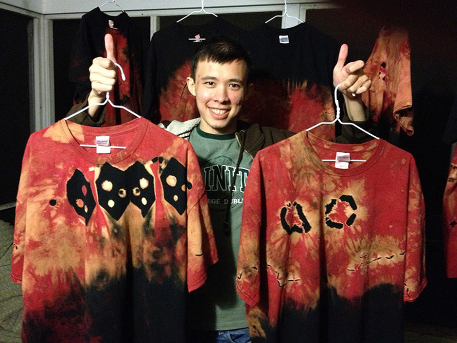
Craig showing off two of our recent successes in the dyehouse
Live Dye Videos
Coming Soon!
My new video camera is still on order, and I want to post videos of a quality high enough so that you can see exactly what we're doing. So please check back here soon, as we'll be bringing you the secrets of fine dyes, live and in color.